So I finally did it, I watched Dario Argento’s 1977 horror film Suspiria. Now you should know that I have been actively dodging this film for close to three years now. That is just based on the fact that I hate horror movies and this film has the reputation as a truly frighting one at that. I have had photography professors scribble the title of this film into my sketchbook telling me I had to watch it. I screened it at Critical Cinema, at the request of Kelise no less, but I just hit the play button and walked away for the night. If it wasn’t for this class I would still be actively running away from it today, but I didn’t I watched it.
I tried to do it in a way that would take away all its power as a truly scary film. I watched it on a sunny day at eleven in the afternoon over lunch. Let me tell you that it didn’t work. After the first 15 minutes, and the most gruesome double murder of the whole film, I felt physically ill, I really regretted the idea of watching it over lunch and I wanted to quit, but I didn’t. I watched it and I got scared and I didn’t like it.
All that being said though I can understand why I was told to watch it by my previous professor and why this professor often mentioned choosing it and the readings for the art students. The colors were really amazing. It wasn’t until after reading the article Expressionist Use of Colour Palette and Set Design in Dario Argento’s Suspiria, that I had a truly deeper understanding of them and I totally understood what I had just witnessed a lot better. I found the film a little confusing at times but as the reading, Dario Argento’s Suspiria, so expertly explains the film is made up of inferences and without such the “scenes are just jumbles of [confusing] weird music and quick cuts.” These inferences described became 100% clearer in the breakdown of the three color categories Argento uses explained in the Expressionist Use of Colour reading:
The first category, the magical is the night time where the dark and sinister primary colors are saturated across the characters and scenery and the presence of witches is inferred as apparent.
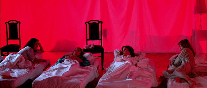
The second category is the day light where its lighter and less ominous but the primary colors are still obvious but not overpowering letting you know that the witches are still around.
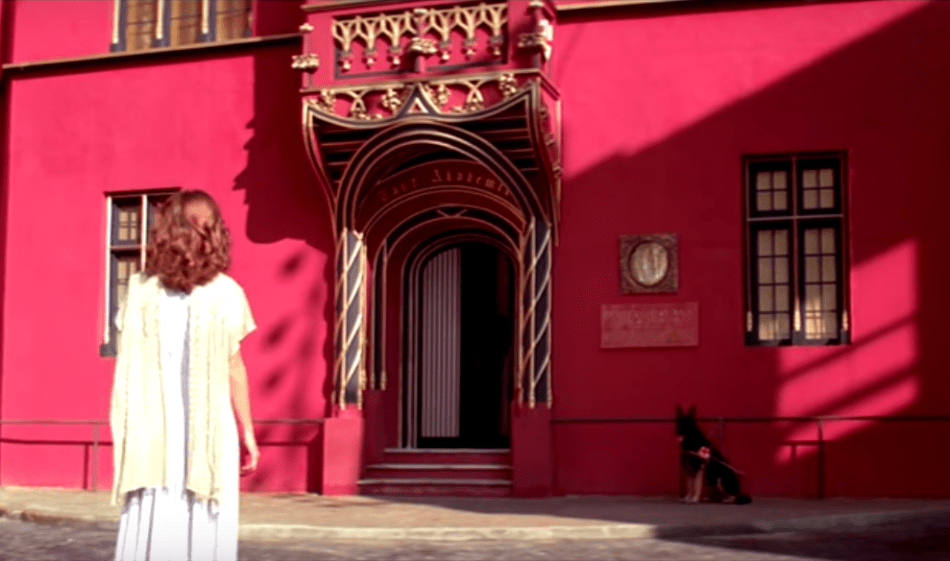
Then last category which I found to be the most effective was that of the monochrome in places such as the convention center, inside Helga’s apartment and even the inside of the airport where the primary colors aren’t the primary focus and the viewer can almost relax for a half a second knowing they are safe from the super natural.

Overall it was a visually beautiful film that I won’t ever watch again.
Lastly, I just wanted to touch on Jaylin’s presentation of Wet Hot American Summer. I had to step away from the computer briefly on Wednesday so I didn’t get to say this during the questions and comments portion at the end but that is one of my all time favorite movies and I think she did a great job at presenting it. I am not however a huge fan of the prequels and sequels as I think they kind of lose the naive charm of original. I will add my favorite of the series, maybe even more than the original movie, is the behind the scenes documentary Hurricane of Fun, The Making of Wet Hot. If you haven’t seen it I highly recommend as its just as fun as the original movie and it feels like you are just hanging on set with cast. It is definitely a documentary you can watch more than once.
*Blog Update* I want to apologize for up-selling Hurricane of Fun, The Making of Wet Hot after just trying to find it for myself it is no where to be found on the internet.
